I love-love-love things like this.
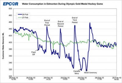
From the Freakonomics blog at the New York Times we get a graph showing water consumption in Edmonton from February 28 – during the men’s Olympic hockey gold medal game.
Green line is the consumption from February 27.
Tags: Freakonomics, graph, NY Times, things I love
